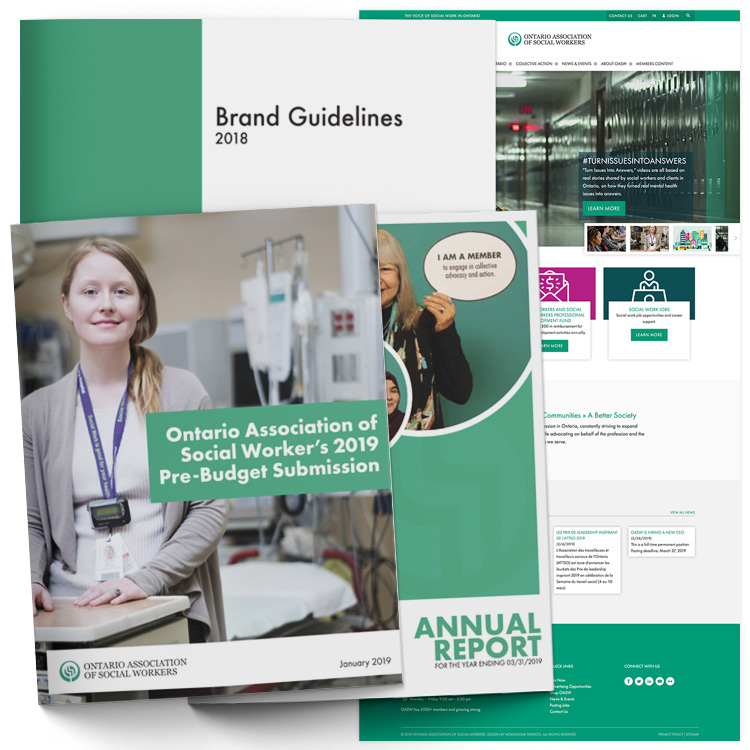
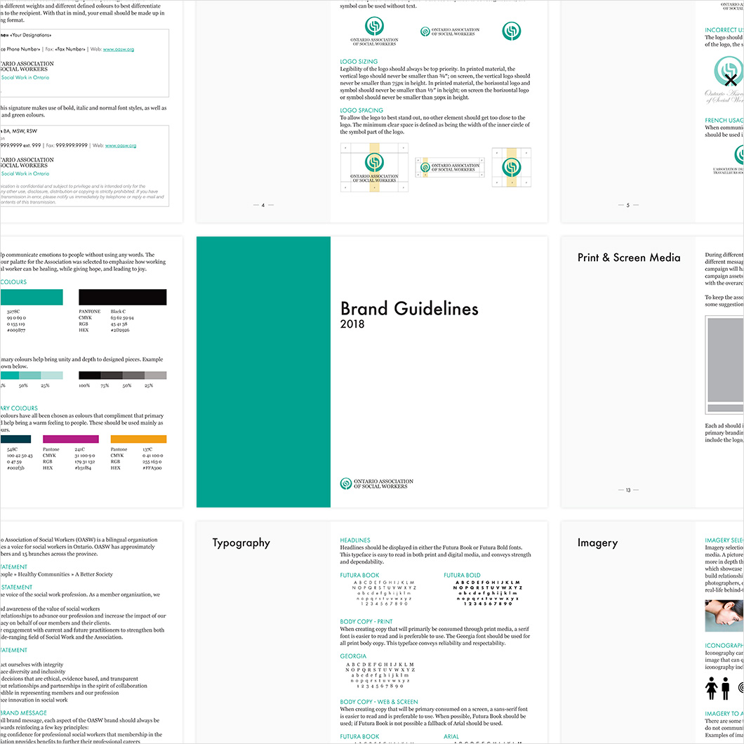
We started with a thorough review of the existing brand and found that there was little consistency – the logo was being used in different applications with different fonts, colours weren’t always consistent, and messaging wasn’t clear and concise. We worked with the association to define how the brand should be used and applied in various different use cases. By providing a full brand standards guide, the association has a thorough understanding of how to best display their brand assets. Included in the brand guide was information on how to use the logo, and update of brand colours, typography which supports the values and stability of the association, and how the brand should be applied to email signatures, business cards, letterhead, print media, screen media, and presentations.
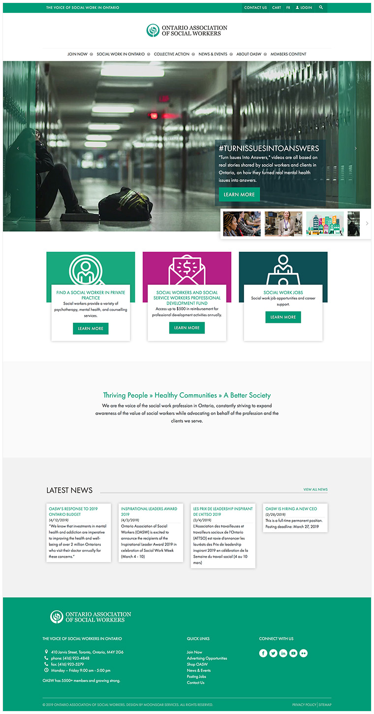
Once the full brand was defined, we worked with the client to update both their English and French public websites to reflect the new branding. The sites became more mobile-friendly and had a higher focus on accessibility standards. As both websites were hosted on iMIS’s RiSE platform, they required a full template development. Additionally, in order to maintain consistency throughout each internal page, we developed a series of internal webpage layouts that could be used by members of the association to allow them to maintain the website on their own after the redesign was completed.
Additionally, we have worked with the client to develop other brand-compliant internal and external marketing materials – including annual reports, email templates, and infographics.