A company can often create a website and let it grow stagnant over the years. Website design trends change at a rapid pace; I’m not saying to go changing each and every new trend that hits the market. That can get very costly, but can also end up confusing your target market if you change things up too rapidly.
Instead, there are a few things that you can do to help rejuvenate your website that will modernize it and help make it connect better with your customers.
Change up the Imagery you are Using
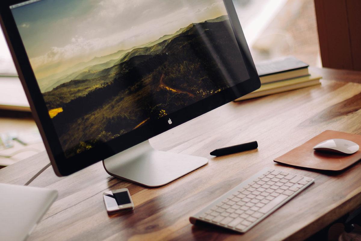
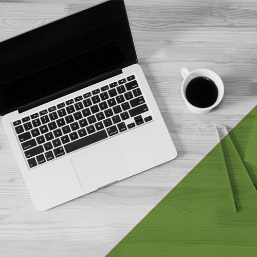
Larger imagery on your front page (or on one of your landing pages) can help connect with people. Not only will it catch attention immediately, it can speak to people. Use imagery of people within your target demographic. Use it to showcase your products in use. But however your change up your images, try to steer away from stock photography that your competitors are using.
Change up the Fonts on Your Website
There’s an amazing tool that Google has – Google Fonts. It allows you to use some of their free fonts on your own websites. Take a browse through and choose two fonts that you really like – one for your body text and one for your headlines. Changing fonts can make a huge difference on the appearance of your website. While working on that, also consider making the font size and leading (line-height) a little larger, which makes it easier to read and looks much more modern.
Make Sure You’re Using the Most Up-To-Date Social Media Icons
Social networks often go through a branding change; their icons and colours change every so often. Utilizing old icons on your website can be one of the fastest ways for your website to be dated. Most social networks will have a branding section – here are some of the most common:
Update the Maximum Width of Your Website
A few years ago, most websites were designed in a fixed width to fit most desktop monitors. Even if you had a flexible or responsive width (a website that can resize depending on how large your monitor is), there was often a maximum width that your website would be viewed at. As monitors are getting larger and larger, the maximum width of your website actually looks quite small on most desktop monitors; changing this to be wider will suit more of your clientele.
Over the next few weeks, we’re going to be going over a few more in-depth things that you can do to improve your website, including:
- updating and reorganizing your navigation
- adding and updating the visual hierarchy
- and creating and improving your calls to action
Check back to learn more with us!